We have all seen the file: current ratios in order, positive equity, a business plan that holds together — and a company that files for protection eighteen months later. The question comes up in almost every transaction we work on, and the accounts rarely answer it cleanly. Can you see a corporate failure coming from the financial statements alone? Put differently: is corporate credit risk visible in the accounts before it is visible in the facts?
Largely, yes — provided you read the right thing. Reviewing only the 20% of files flagged as riskiest surfaces just under 70% of the companies that go on to fail within three years. And more importantly for anyone sitting on an investment committee: every prediction can be traced back to specific lines in the accounts.
Why explainable AI decides everything in corporate credit risk
A model that says “this company is risky” without saying why is unusable. Not because it is wrong, but because no board approves a decision it cannot examine, and no regulator accepts a credit assessment that cannot be reconstructed.
So the exercise here is not only to predict. Each prediction is decomposed using SHAP (Shapley values, borrowed from game theory) into the accounting facts that raised the risk and those that lowered it, with the weight of each. Anyone holding the financial statements can check the reasoning line by line.
Measuring corporate credit risk: data, models and out-of-time validation
The data. 78,682 annual filings from 8,971 companies listed on Nasdaq and the NYSE between 1999 and 2018. Over that period, 609 of them failed — 6.8%.
The question. Not “will this company fail one day?”, which helps nobody, but “will it default within three years?” — the horizon a credit committee actually works with. On that definition, a company is flagged only over its final three financial years.
The indicators. Eighteen balance-sheet and income-statement line items, from which 95 measures are derived: the usual liquidity, leverage and profitability ratios, the Altman Z-score — and, above all, trajectory measures: how each ratio has moved over one, two and three years, whether earnings have fallen several years running, whether reserves are eroding. The fiscal year itself is deliberately left out: it cannot be extrapolated into the future, and would leave a model essentially blind to any year it has not yet seen.
The test. Validation is strictly out-of-time, following the protocol recommended by the dataset’s authors: the model learns on 1999–2011, is tuned on 2012–2014, and is judged on 2015–2018 — years it has never seen, and 3,700 companies it has never encountered, 119 of which went on to fail. It is never shown the future, which rules out the most common way of flattering this kind of result.
Five families of model were compared, from simple clustering to gradient boosting and neural networks. Because failures are rare — 2.1% of the observations in the test period — the training set was rebalanced with synthetic minority over-sampling. That choice was tested both ways rather than assumed: it improves ranking by roughly two points, while slightly degrading the accuracy of the absolute probabilities.
What separates companies that fail
Before any modelling, the raw comparison already tells the story. Median values over the test period:
| Healthy | Failing within 3 years | |
|---|---|---|
| Altman Z-score | 3.42 | −0.01 |
| Market value / book value | 2.68 | 0.51 |
| Accumulated reserves / assets | −0.03 | −0.78 |
| Return on assets | +1 % | −21 % |
| Debt / assets | 55 % | 90 % |
| Current ratio | 1.87 | 1.22 |
The first line deserves a pause. The Altman Z-score dates from 1968 and has not changed since; it places the distress zone below 1.8. Companies heading for failure sit at zero, the others at 3.42. The two populations fall either side of a threshold set half a century ago — and neither the model nor its author had any hand in that.
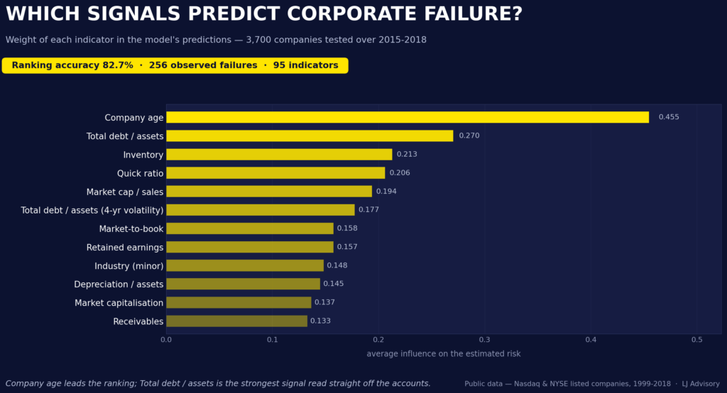
Three signals dominate, and none will surprise a credit analyst.
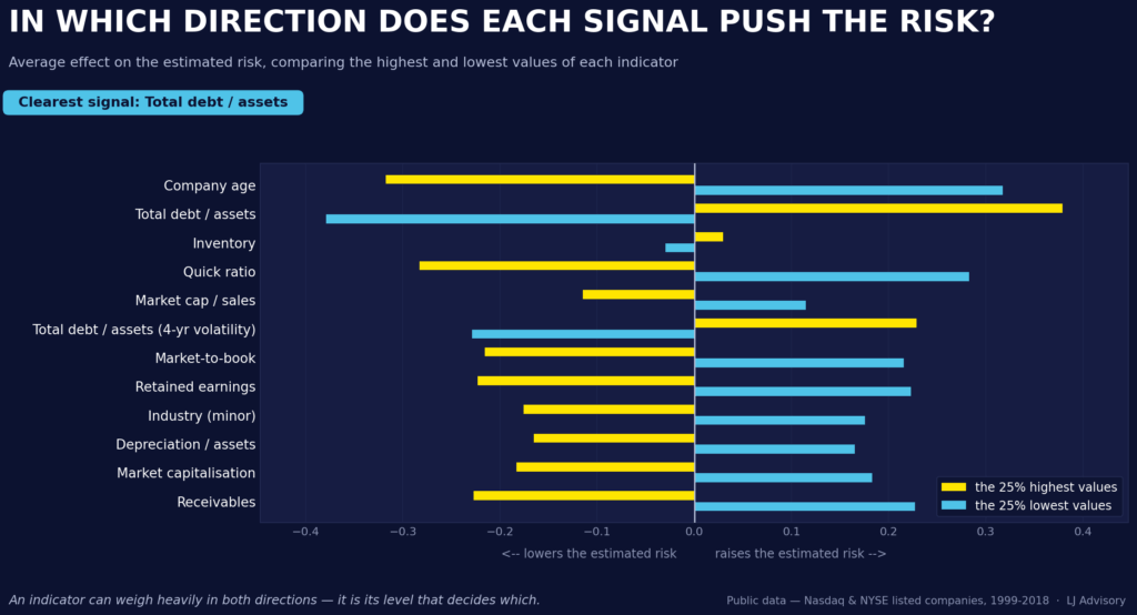
Company age. Younger companies carry markedly higher risk; older ones benefit from a premium that no single accounting ratio captures directly — experience with their own business cycle, established supplier and customer relationships, management that has already weathered a difficult stretch.
Leverage. By far the most discriminating signal in the entire study: debt at 90% of assets against 55% leaves nothing left to renegotiate.
Liquidity. Can a company cover its short-term liabilities without selling inventory? Where the answer is no, risk rises markedly.
One trajectory measure also ranks near the top: how much leverage swings over four years. It is not only the level of a ratio that counts, but its stability — a company whose leverage swings sharply from year to year is rated more cautiously by the model than one with the same average but a steadier path.
Which sectors actually break
No model needed here — simply the share of companies in each sector that failed between 1999 and 2018. Only sectors with at least thirty listed companies are shown; below that, one or two cases move the number by several points. The benchmark: 6.8% across all industries.
| Most exposed | Failed | Firms | Most resilient | Failed | Firms | |
|---|---|---|---|---|---|---|
| Air transportation | 30.6 % | 49 | Oil refining | 2.6 % | 38 | |
| Apparel retail | 26.8 % | 71 | Wholesale, durable goods | 2.8 % | 215 | |
| Shipping | 25.6 % | 39 | Primary metals | 2.8 % | 107 | |
| Furniture & home | 18.8 % | 48 | Specialist contractors | 2.9 % | 34 | |
| Oil & gas extraction | 17.1 % | 386 | Non-bank lenders | 2.9 % | 43 |
Two decades rarely hand a dataset this many shocks. The dot-com collapse of 2000–2002, compounded by 11 September. The subprime crisis of 2008–2009 and the European sovereign debt episode that followed. A long recovery on historically low rates, interrupted by the 2014–2016 oil price collapse, when the barrel fell from over $100 to under $30. Every sector below was tested against at least one of them — and the survivors were not chosen at random.
The two most exposed sectors
Air transportation — 30.6% failed (49 companies). Four and a half times the base rate. The sector absorbed both great shocks of the period head-on: 11 September and the 2001–2002 recession, then the 2008 crisis against a backdrop of expensive jet fuel. The balance sheet explains the rest — massive fixed costs, fleets financed on credit, and demand that evaporates precisely when debt service does not. Several major carriers passed through Chapter 11 between 2002 and 2011.


Apparel retail — 26.8% failed (71 companies). Almost four times the base rate, and the one sector whose decline owes nothing to a macroeconomic shock. The period covers the rise of e-commerce and the slow emptying of American shopping malls. The financial signature is unmistakable: rents fixed by long leases, inventory that ages badly, and margins compressed from both ends. A structural squeeze, not a cyclical one.
The two most resilient

Oil refining — 2.6% failed (38 companies). The most instructive figure in the table, because oil and gas extraction, in the same value chain, loses one company in six. A refiner earns on the spread between crude and finished products; the level of the barrel matters far less. Upstream, revenue depends on a world price nobody controls while the capital is already sunk into the ground. The 2014–2016 collapse devastated one and barely touched the other.
Wholesale, durable goods — 2.8% failed (215 companies, one of the largest samples here). The intermediary position protects. Few fixed assets, no plant to amortise, customers spread across many industries. Above all, a distributor’s balance sheet breathes with activity: in a downturn, inventory and receivables contract and release cash precisely when it is scarce elsewhere — the opposite of a manufacturer trapped by fixed costs. The 2001 and 2008–2009 recessions compressed margins, rarely solvency.

The pattern runs through the balance sheets rather than the headlines. Sectors at the top are capital-heavy, structurally indebted, and sell at prices they do not set — so a downturn hits revenue while debt service holds firm. Those at the bottom are asset-light, lightly geared, and serve demand that does not disappear.
That combination — heavy capital, structural debt, prices taken rather than set — describes a good part of the industrial and infrastructure assets that come across a transaction desk. It is not a sector effect so much as a balance-sheet signature, and it travels: the same profile in an unlisted mid-cap deserves the same caution.
Does it work? Five machine learning models compared
Two ways of answering, one technical and one useful.
The technical answer. Shown two companies — one that failed, one that did not — the best model puts the right one first just over 83% of the time.
| Model | Ranking accuracy | Failures caught in the riskiest 20% |
|---|---|---|
| Random Forest | 83.6 % | 68 % |
| Gradient boosting (LightGBM) | 82.7 % | 72 % |
| Logistic regression | 81.3 % | 70 % |
| Neural network | 75.4 % | 54 % |
| Clustering with rules | 68.1 % | 60 % |
With only 256 defaults observed, the margin of error on each figure is around ±3 points — so the gap between the first three models is not statistically meaningful. Tree-based methods and the linear benchmark are effectively tied; only clustering and the neural network fall clearly behind. In corporate credit risk, then, model sophistication matters less than the quality and historical depth of the accounts you feed it.
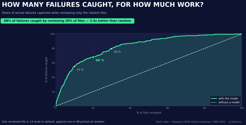
Widen the review to 30% of files and you reach 80% — the curve flattens quickly after that, which is exactly what makes 20% the efficient point.
The useful answer. Review the 20% of files ranked riskiest, and you capture 68% of the companies that go on to fail — 3.4 times what a random pick would deliver at the same 2.1% base rate.
Can the numbers be read as probabilities?
Only if the model has been calibrated for it — which is easy to skip, and frequently is. A raw risk score is a ranking device, not a probability: it says this company is riskier than that one, nothing more.
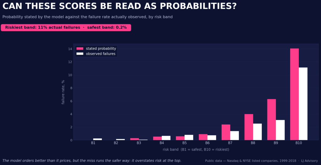
Calibration holds up about as well as you can expect from a method with 256 observed defaults, no better. In the safest risk band, the stated value is close to zero; the observed rate is 0.24% — an understatement with no consequence at that scale. In the riskiest band, the model states 14.1%; the observed rate is 11.1% — an overstatement of just under three points. For portfolio screening, that is the right direction to be wrong in: it ranks better than it prices, and where it misses, it errs cautiously rather than blindly.
One company, opened up: explainable AI in practice
An average ranking tells you which indicators matter in general. A committee needs something else: why this file, and on what evidence.
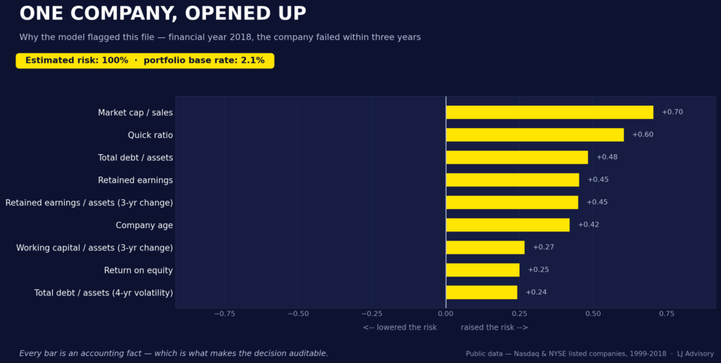
This company, ten years in the market at last count, reaches the highest risk tier on the scale in the fiscal year shown — with debt that narrowly exceeds total assets, liquidity coverage far below the healthy range, and retained earnings deep in negative territory, on a three-year trend that has deteriorated further still. One detail is worth flagging: return on equity looks high at +20, but with debt above 100% of assets, equity is arithmetically almost wiped out — the ratio is distorted here by a hollowed-out denominator, not by genuine earning power, and the model weighs it accordingly as an additional warning sign rather than as reassurance.
Read it as a credit note rather than a model output. Each bar to the right is a fact that pushed this company towards default; each bar to the left, a fact that argued against it. The length is the weight the model gave it. Nothing is hidden in an aggregate: a file can be flagged on two decisive items while a dozen others point the other way — and you can see that immediately, which is exactly what a committee needs in order to disagree with the machine.
This is what makes the model falsifiable in the field. If the decomposition rests on a receivables position that the data room shows to be a one-off, the conclusion can be set aside on the merits rather than on instinct. A score alone offers no such foothold — and every bar here is a line in the accounts, verifiable by anyone holding the statements. Nothing rests on the model’s authority.
What this changes at each stage of a transaction
Sourcing and opportunity review. This is where the approach earns its keep the most. Faced with a long target list, it sets the order in which files get opened: reviewing the 20% flagged riskiest surfaces just under 70% of the situations that go on to deteriorate. It replaces no judgement — it decides what gets looked at first, and on a list of eighty names, that alone changes how a team spends its weeks.
Valuation. A target with thin or eroding reserves warrants a higher discount rate, even where current ratios look sound. Belonging to a historically fragile sector calls for the same reflex. These are basis points on a WACC, not an opinion — and far easier to defend when the underlying trajectory is on the table.
Due diligence. Data rooms rarely hold more than three fiscal years. The filed statements, however, are public and available at almost no cost: two extra years often change the reading, for a few minutes’ work. The marginal cost is nil, the information gain considerable. We read the history of retained earnings and its direction before the current ratios. And we treat stability as information in its own right — a ratio that has been mediocre but steady for ten years is a business model, not a warning. It is the file that was comfortable three years ago and is merely acceptable today that earns the extra week.
Structuring and closing. Where the analysis reveals material sector or cyclical exposure: price adjustment clauses indexed to sector indicators, earn-outs normalised for sector performance, strengthened warranties on the business plan’s sector assumptions. The point is not to price the risk out of the deal, but to place it where it can be carried.
What this study does not say
It covers listed US companies, 1999 to 2018. Nothing here bears on later events. Risk behaves differently in Europe, in Asia, in emerging markets — and differently again for mid-caps, which are smaller, less capitalised and not subject to the same disclosure. The sector rates are historical frequencies over a specific twenty-year window, not structural constants: primary metals owe part of their record to a commodity supercycle that has since ended, and apparel retail’s decline continued well past 2018.
The date of failure is approximate. The data records that a company failed, not when. The event is placed at the last published financial year — a reasonable proxy, and the three-year horizon rests on it.
What is missing matters. Management quality, governance, pending litigation, customer concentration, ESG exposure. Frequently decisive, entirely absent from the accounts.
Conclusion
One factor runs through the whole study: age, leverage and liquidity beat any single-year snapshot of profitability. A young, highly leveraged company with tight liquidity coverage is vulnerable — profitable today or not, in a buoyant sector or not. Retained earnings and their multi-year direction complete the picture, as the case study above shows. The sector sets how hard you should look, not the answer.
For M&A and private equity, the implication is direct: a target’s multi-year trajectory, not its closing-date snapshot, belongs at the centre of the work — from the first screening of a target list through to the warranties negotiated at closing.
Machine learning does not overturn corporate credit risk analysis. It confirms it, ranks it, and puts numbers on it — while making every conclusion traceable to a line in the accounts. That last point is not a detail. It is what makes the difference between a tool a committee can use and one it politely ignores.
Applying this to a live file
The method described here, applied to corporate credit risk, is the one we bring to a transaction: making a run of fiscal years comparable before reading a trend into them, benchmarking a target against its sector rather than in a vacuum, and putting a defensible number on fragility when it comes to pricing it.
If you have a target list to prioritise, a valuation where the trajectory is contested, or a due diligence where the accounts look sound and something still does not sit right — that conversation is worth having.
The source code is freely available on GitHub.
A note on method, and its limits. This is a methodological exercise on a single public dataset, one market, one period. Its results depend on choices that could reasonably have been made otherwise — the three-year horizon, the chronological split, the handling of rare events — and different choices would yield different figures. A model calibrated on that period would need recalibrating before use in current conditions or on another market. None of this constitutes a production credit model, nor investment advice or a credit recommendation.
This study was built iteratively with AI assistance, over various versions. Several were discarded outright when a check failed. What is published here is what survived those checks; the verification scripts sit in the repository alongside the code.
About LJ Advisory
M&A and capital allocation for mid-market funds, energy and industrial players, and entrepreneurs operating across borders.